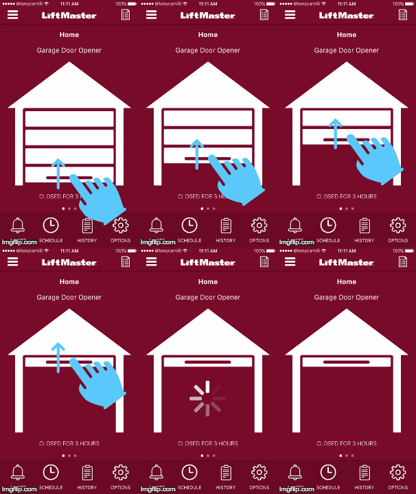
As a design and product management exercise, I've been thinking about taking the apps that I use on a day-to-day basis and redesigning or adding the features that I would like to have (see my post on Find my Apple TV Remote). I really love the utility of the LiftMaster MyQ remote app for opening/closing my garage and monitoring when someone else opens it. However, I find the app itself fairly lacking in design and there are some definite usability challenges that I am thinking through.
It all starts with the login screen. In the image above you can see the original screen on the left, and my rework on the right. In the original screen, the LiftMaster logo is right underneath the iOS status bar with little to no visual break between the two. In fact, the entire UI seems to be pushed up on the screen resulting in a top-heavy look. I have attempted to make the entire screen more balanced, with a bulk of the UI in the middle of the screen with more padding around the LiftMaster logo.
Two things really drove me nuts in the original design: A radio button for the "Remember Login" option and that hideous black Login button done in a mid-90's Microsoft Aero style. Radio buttons are intended to allow the user to select between multiple, mutually exclusive options. A single radio button makes no sense. A checkbox could suffice, but why create a new control. I've used the standard iOS on/off toggle instead. For the Login button, I've simply gone with an iOS 10-style flat button.
For the text boxes, I've gone with a more modern look with animating labels and lines rather than boxes.
The remaining changes were about removing clutter from the screen. The "Forgot Password" link is the only thing I've considered adding back, but it can be made dynamic to only show once a unknown password was entered.
I removed the "Learn more about myQ" link. That really belongs in the app store description rather than on the first page of the app. If you don't already know what myQ is, the app won't do you any good.
Finally for the "sign up" link. Typical signup for MyQ is on the web when you are setting up a myQ device. However, rather than removing this from the app, I made it an alternate tab on the login experience. I can foresee a user wanting to set this up entirely in the garage while installing their myQ garage door opener. The sign-up screen will be my next project.


