REDESIGNING THE LIFTMASTER APP STEP 1.0: THE MAIN SCREEN
For the main UI, I didn't go too drastic. The main point of the app is to open your garage door, so I've left the garage as the main focal point of the screen. I have never liked the grey color scheme in the app, so I have updated the screen to use the same LiftMaster crimson found elsewhere. I also didn't like the garage image, so I have replaced it with a simpler, larger garage.
There are several configuration options in the LiftMaster app and most of them are device-specific. This requires a lot of navigation currently. For example, to configure an alert, you have to go through Hamburger Menu -> Alerts -> [Choose Location] -> [Choose Device]. I have attempted to make these settings (1) easier to navigate and (2) more contextual by putting them at the bottom of the main screen. This simplifies the hamburger menu (and may allow it to be eliminated entirely in a future iteration) and allows you to immediately add/remove/configure settings for the door you are currently viewing.
The main change I would make, however, isn't visible on the render above. I have talked to a few other people who use the LiftMaster app, and collectively we have all experienced the same problem: It's really easy to accidentally open or close your garage door. That's because opening or closing requires a simple tap. Lately, LiftMaster has added an additional TouchID verification before opening the door, but that's really a hack. Adding an additional authentication step to work around bad interaction design is both poor interaction design and poor security.
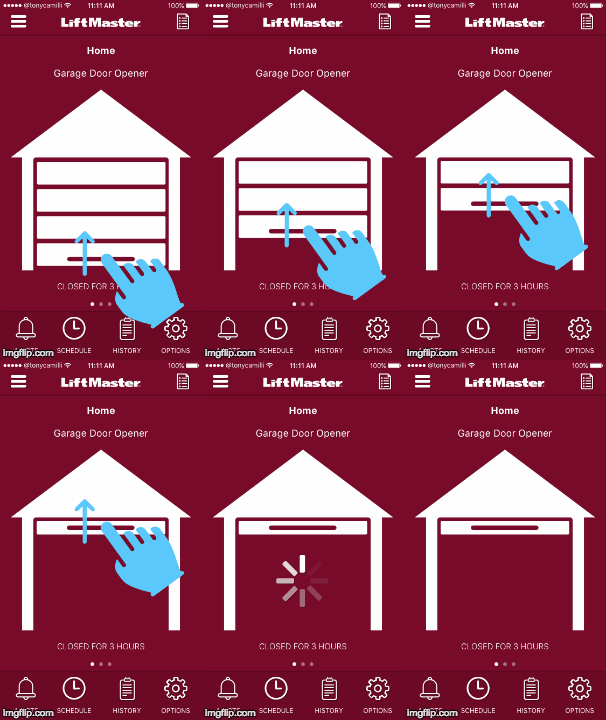
I would propose a swipe gesture to open the garage. That's the main reason I made the garage image larger. The second thing I did was add a "handle" to the bottom of the garage. Now, to open the garage, a user will swipe from the handle upward. Only when the garage door has been completely swiped up (or down) with the door be opened (or closed). The app could also use haptic feedback to let you know when the swipe has reached 100% (or 0%). See the GIF below for an example:
Swipe to open
I haven't done the research, but I would imagine 90% or more of LiftMaster users either have only one garage door, or if they have two, primarily use only one. To accommodate multiple garages today, LiftMaster allows swiping through tabs of devices (gates, door, lights). This is fine for a small number of devices, and so I left that model in place for my redesign. However, there was initially no way of seeing all (or at least several) devices at once. LiftMaster recently addressed this by adding a table view (grid of icons). This works in that all the devices and their states are glanceable, but you run into the same accidental action product as the larger, single device screen. My swipe gesture proposal probably wouldn't work well on this table view because the icons are much smaller. So what I would propose for multiple device is a list view (a.k.a. table with only one column). This list view would provide the same glance-ability but could use swipe left or right gestures for open/close and tapping on the device could take the user to the full view.
